How to Add a Sepia Filter to a Photo
Add a sepia filter to your photo online. Compare warm monochrome tones on the same image, adjust tonal balance, and try your own photo with free PNG export.
TL;DR
- Open the worked sepia recipe, choose Use your own image, and export a PNG for free.
- A five-stop brown palette keeps black and white endpoints while warming the tones between them.
- Adjust Tone balance gently; faded color, grain and damaged paper are separate creative choices.

To add a sepia filter to a photo, open the worked sepia recipe, choose Use your own image, and export a PNG. The recipe turns the image into warm monochrome using Gradient Map: deep tones stay dark, middle tones become brown, and the brightest tones approach white.
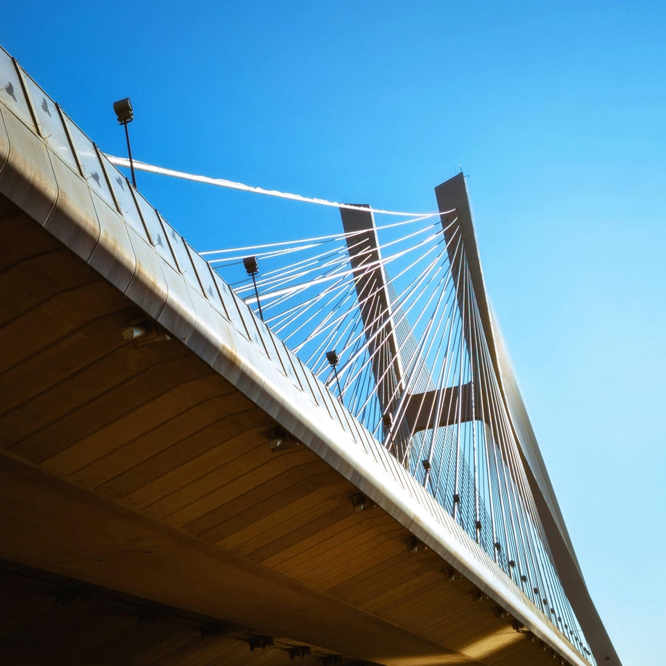
Original, left. Sepia recipe, right. The full frame, bridge cables and structural detail stay in the same positions. No grain, blur, stains or scratches are added.
The link opens this bridge photograph with the demonstrated palette already applied. Replacing the sample keeps the effects and controls. This is a configured recipe, so you do not need to rebuild the palette first.
Make a sepia photo online
- Open the sepia recipe in your browser. The demo adapts down to 320 px wide, including landscape. On a phone, use Layers, FX, Edit and Animate along the bottom.
- Choose Use your own image. Open a PNG, JPG, WebP or HEIC. Your photo replaces the bridge while the five-stop brown palette stays in place.
- Open Active FX and expand Gradient Map. If the panel is closed, choose Right in the toolbar. Start with Tone balance 0 and Mix 100. Keep the artwork in Still while comparing.
- Adjust the tones, then choose Export → PNG. The free demo exports a still. A small Artfkt watermark is on by default; turn it off for free in Settings → Export Settings if you prefer.
You can also download the practice photo (960 × 960) to follow the comparisons exactly. All examples use the same source and preserve its square framing.
Sepia versus black and white
A sepia image is monochrome, but its tones are warm brown rather than neutral gray. Changing the palette can change the mood without introducing scratches or making the scene look faded.

Black & White with its default channel weights, left. The sepia Gradient Map recipe, right. These are two different tonal conversions; the comparison shows their overall results.
Watch the underside of the bridge as well as the bright cables. A convincing treatment should leave useful separation in both. For neutral monochrome camera interpretations, compare our black-and-white film looks.
Keep the dark and light ends of the image useful
A simple two-color treatment can work for graphic artwork, but brown shadows and cream highlights also lift the black floor and tint the lightest areas. Our recipe uses five stops instead: black, dark brown, medium brown, pale warm gray and white.

Two-color Duotone, left: Shadows #3b2415, Highlights #f6e5c6, Tonal balance 0.50, Transition 1.00. Five-stop Gradient Map, right: the recipe below. Each effect uses Normal blend and Mix 100; no other effects are applied.
The right-hand version is the starting point for this guide, rather than a claim that all real sepia prints have the same curve. In photographic printing, the paper, toner and processing affect the result. Wolfgang Moersch’s brown-toning comparisons demonstrate substantial variation in hue and shadow density. ILFORD’s paper guide also distinguishes image tone and paper surface.
This recipe is an artistic digital interpretation, not a calibrated simulation of a named paper or chemical bath. It changes image tones. It does not reproduce physical print permanence or restore an old photograph.
Adjust Tone balance without losing detail
Tone balance moves the source brightness through the palette. Positive values brighten the mapping; negative values darken it. It is separate from choosing a warmer or cooler brown.

Tone balance −0.10, left; +0.10, right. Only Tone balance changes. The source, palette, stop positions, blend mode and Mix stay fixed.
Return to 0 if the underside becomes a solid dark area or the bright sky loses its gradation. Strong adjustments can clip tones at either end; they cannot recover detail absent from the source. For a different warmth, edit the middle brown stops while keeping the two endpoints. Lowering Mix blends the original colors back in, so it no longer gives a fully monochrome result.
Exact recipe settings
Use one Gradient Map, Normal blend, Mix 100, Tone balance 0, with animation off. Set Gradient to these five fully opaque stops:
| Position | Color |
|---|---|
| 0% | #000000 |
| 25% | #423529 |
| 50% | #8e7356 |
| 75% | #cbb99d |
| 100% | #ffffff |
Each segment uses Linear easing with its midpoint at 50%; gradient opacity is 100%. The worked recipe supplies these settings. The general Gradient Map tutorial explains palette editing in more detail.
Is sepia the same as a vintage photo filter?
Sepia is one warm monochrome choice. An aged color print can instead retain several colors, fade unevenly and acquire handling marks. Our vintage photo guide treats color fading and print wear separately. Start there if that is the result you want.
Grain and surface damage are optional additions. Judge the sepia tones on their own before adding them; this bridge example uses neither. A yellow cast across every highlight is a creative paper-color choice, not a requirement for every sepia treatment.
Try your photo, then keep the result
Try Sepia on your photo and export a still in the free browser demo. If you want to save and revisit an editable composition, explore Artfkt desktop, with saved projects and the wider desktop collection catalog. Check the offer below for the current purchase destination.
Source photograph: Lukasz Szmigiel on Unsplash, used under the Unsplash License. The examples retain the full frame; only the stated tonal treatments and proportional display resizing were applied.
Make something unexpected
No subscriptions. More room to create.
Bring all collections and multiple image layers together in one desktop studio. Build a look, shape its motion, and save your next starting point.
Pay US$29 once at launch (regularly US$39). Includes all current collections and Artfkt 1.x updates.
Future major upgrades are not included.